
Image module
Frontfire UI provides a set of image styles that can align and size images beautifully and provide decorations and overlay styles.
This module is available in the Minimal and Complete bundles.
Block alignment
Centre alignment
To centre an image horizontally, add the center class to it.
It should be inserted between other block elements like paragraphs or tables.
The image size should be specified if it’s not the image’s intrinsic size. An absolute image size is fine, the CSS classes will take care about the necessary scaling down on smaller screens. It is important that only the width of the image is specified to maintain its aspect ratio, not the height; otherwise, the image will be distorted on smaller screens.
Lorem ipsum dolor sit amet, consectetur adipiscing elit. Cras vehicula nisl et orci luctus laoreet. Maecenas vitae rhoncus dui, eu eleifend leo. Proin facilisis dignissim tristique. Nullam metus sapien, pulvinar vel urna in, faucibus pretium metus. In tincidunt sed sapien sed pharetra. Aenean vitae ex in tortor egestas fringilla eget ac massa.
Sed justo est, pulvinar at interdum at, malesuada eget mi. Nam non erat et enim scelerisque congue. Nullam quis pellentesque magna. Fusce elementum, elit vel ultricies blandit, lacus massa vehicula odio, at malesuada nisi elit in metus.
Full-width placement
Images can be expanded to always fill the entire row with the full-width class.
Be aware that these images may become very tall on wide windows.
So images with a wide aspect ratio are most suitable for this placement.
You might also restrict the content width for the page.
Lorem ipsum dolor sit amet, consectetur adipiscing elit. Etiam convallis mollis odio, id eleifend metus elementum at. Fusce tristique odio non ligula commodo mattis et vitae purus. Cras fermentum tellus eleifend odio pharetra, non accumsan quam luctus. Morbi sodales tortor elit, id aliquam metus efficitur semper. Nunc accumsan imperdiet laoreet. Sed ut egestas felis.

Nullam risus nisl, tincidunt in luctus non, luctus sed eros. Integer sodales lectus eget neque tincidunt convallis. Class aptent taciti sociosqu ad litora torquent per conubia nostra, per inceptos himenaeos. Fusce nec nisi non eros tempus porttitor ac quis orci. Curabitur auctor viverra ligula, sed condimentum magna sollicitudin non. Phasellus egestas eleifend sodales.
Page-wide placement
To make images even bigger, they can be placed outside of a page-width element to fill the entire window width.
The page-width container must be closed before and reopened after the image element.
Since there must only be a single <main> element on a page, if you want to break it up to allow full-width images, you have to introduce another level between <main> and the content that applies the page-width class for restricted width.
A simple <div class="page-width"> will do.
The following example simulates a reduced --page-width and the center class on the <html> element.
Lorem ipsum dolor sit amet, consectetur adipiscing elit. Etiam convallis mollis odio, id eleifend metus elementum at. Fusce tristique odio non ligula commodo mattis et vitae purus. Cras fermentum tellus eleifend odio pharetra, non accumsan quam luctus. Morbi sodales tortor elit, id aliquam metus efficitur semper. Nunc accumsan imperdiet laoreet. Sed ut egestas felis.
Nullam risus nisl, tincidunt in luctus non, luctus sed eros. Integer sodales lectus eget neque tincidunt convallis. Class aptent taciti sociosqu ad litora torquent per conubia nostra, per inceptos himenaeos. Fusce nec nisi non eros tempus porttitor ac quis orci. Curabitur auctor viverra ligula, sed condimentum magna sollicitudin non. Phasellus egestas eleifend sodales.
Floating alignment
Left or right alignment
Images are placed at the left or right side floating besides the text by simply adding the left or right CSS class.
The image size should be specified if it’s not the image’s intrinsic size. An absolute image size is fine, the CSS classes will take care about the necessary scaling down on smaller screens. It is important that only the width of the image is specified to maintain its aspect ratio, not the height; otherwise, the image will be distorted on smaller screens. Images on the left or right side are limited to half the window width.
 Lorem ipsum dolor sit amet, consectetur adipiscing elit. Ut arcu ante, gravida nec lectus vel, egestas ullamcorper leo. Duis euismod libero at tellus fermentum, vel ornare ex viverra. Aliquam dui ligula, blandit vel tortor nec, gravida tristique ipsum. Curabitur ullamcorper, enim non rhoncus pulvinar, purus tortor condimentum ante, placerat viverra eros dolor in justo.
 In hac habitasse platea dictumst. Sed rutrum leo sem, sed congue augue rhoncus eget. Donec in venenatis nunc. Morbi a venenatis diam, ut convallis mauris. Duis vitae tempor mi, consequat laoreet nulla. Praesent accumsan dictum justo sed fermentum. Suspendisse eget sollicitudin turpis. Class aptent taciti sociosqu ad litora torquent per conubia nostra, per inceptos himenaeos. Nam ligula nisl, condimentum ac pharetra vel, aliquet at elit.
Integer vulputate magna ut arcu viverra, id ultricies libero ornare. Sed tempus imperdiet augue, ac hendrerit nisl imperdiet dapibus. Aenean id velit in nisl lacinia scelerisque. Integer ut nibh sit amet magna rutrum vulputate eget convallis urna. Aliquam faucibus egestas eleifend. Pellentesque habitant morbi tristique senectus et netus et malesuada fames ac turpis egestas. Duis maximus sem a diam iaculis, ut tristique augue fringilla. Vestibulum dignissim vulputate mi eget accumsan. Sed tincidunt ullamcorper arcu. Sed sem metus, laoreet vitae placerat vel, dapibus eget elit.
Responsive layout
If an image should stop floating below a minimum screen width, one of the classes require-minitab, require-tablet, require-desktop and require-wide can be added.
The image will then turn to a block image if the viewport gets narrower than the specified type.
The image remains aligned at the side where it would have floated.
This can be overridden with the classes narrow-left, narrow-right, narrow-center and narrow-full-width.
Reduce the browser window width to see the effects in the following example.
Lorem ipsum dolor sit amet, consectetur adipiscing elit. Ut arcu ante, gravida nec lectus vel, egestas ullamcorper leo. Duis euismod libero at tellus fermentum, vel ornare ex viverra. Aliquam dui ligula, blandit vel tortor nec, gravida tristique ipsum. Curabitur ullamcorper, enim non rhoncus pulvinar, purus tortor condimentum ante, placerat viverra eros dolor in justo.
In hac habitasse platea dictumst. Sed rutrum leo sem, sed congue augue rhoncus eget. Donec in venenatis nunc. Morbi a venenatis diam, ut convallis mauris. Duis vitae tempor mi, consequat laoreet nulla. Praesent accumsan dictum justo sed fermentum. Suspendisse eget sollicitudin turpis. Class aptent taciti sociosqu ad litora torquent per conubia nostra, per inceptos himenaeos. Nam ligula nisl, condimentum ac pharetra vel, aliquet at elit.
Integer vulputate magna ut arcu viverra, id ultricies libero ornare. Sed tempus imperdiet augue, ac hendrerit nisl imperdiet dapibus. Aenean id velit in nisl lacinia scelerisque. Integer ut nibh sit amet magna rutrum vulputate eget convallis urna. Aliquam faucibus egestas eleifend. Pellentesque habitant morbi tristique senectus et netus et malesuada fames ac turpis egestas. Duis maximus sem a diam iaculis, ut tristique augue fringilla. Vestibulum dignissim vulputate mi eget accumsan. Sed tincidunt ullamcorper arcu. Sed sem metus, laoreet vitae placerat vel, dapibus eget elit.
Image as links
Images can be placed in a hyperlink as well. The image then becomes part of the link and can be clicked. There is no visual indication of the link such as a border, you can bring your own if you like.
Image decorations
There are several CSS classes for quick image decorations or styles.
Drop shadow
Add a slight drop shadow to the image to make it pop out a little with the shadow class.
White border
Add a white border around the image with the white-border class.
On a white page background, the white border also works well when combined with a drop shadow.
Clip to circle
Clip the square image to a circle with the shadow class.
Non-square images will generate an ellipse shape.
Invert in dark theme
Invert the image in the dark theme with the dark-invert class.
Use the dark theme toggle switch in the page header to see the effect.
This is most useful for icons or logos with a black colour on a white or transparent background.

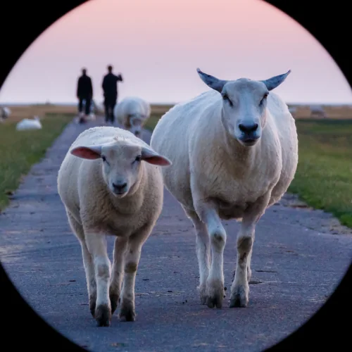
Illustration: Abin Varghese / Unsplash
Image captions
To combine an image with a caption text below it, use a <div> element that contains the image and then the caption content.
For block images, the <div> element has the image-center or image-full-width class.
For floating images, the <div> element has the image-left or image-right class.
The width of a centred image can be set normally for the image itself.
The width of a left or right floating image should be set for the parent <div> container instead, so that the caption text is also limited to that width.
The same additional classes as for responsive layout can be applied on the container element.
The example also shows an image in a link.
The text colour of the caption text can be set with the --image-caption-color CSS variable.
Lorem ipsum dolor sit amet, consectetur adipiscing elit. Nulla urna quam, aliquet sit amet elit sed, facilisis vestibulum erat. Sed odio mauris, tincidunt sed ligula nec, malesuada dictum massa. Aliquam accumsan in nunc nec maximus. Mauris tristique nibh fermentum nibh aliquet, sit amet sodales massa dignissim. Nulla cursus magna massa, et congue mauris vulputate nec. Maecenas vehicula leo ac consectetur iaculis.
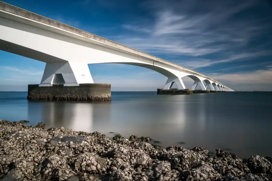
Zeeland Bridge, the longest bridge in the Netherlands
Fusce malesuada neque diam, in pellentesque elit malesuada sed. Vestibulum ante ipsum primis in faucibus orci luctus et ultrices posuere cubilia curae; Nam ut odio nulla. Aenean fringilla eros quam. Proin sit amet faucibus quam.
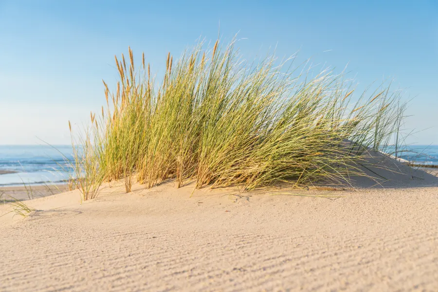
A little sand dune with beach grass at the North Sea beach
Praesent aliquet massa eget nulla interdum, vitae ultrices odio ornare. Etiam non elementum odio. Pellentesque eget vestibulum orci. Duis eget libero euismod, fringilla eros vel, mollis leo. Praesent dignissim, quam feugiat auctor auctor, libero tellus mattis neque, ac ornare nulla tortor vitae velit.
Nullam tempus quis dolor vitae tincidunt. Sed turpis nunc, sagittis at iaculis eget, mollis sed sapien. Mauris ornare vitae nisi ultricies sagittis.
Nam consectetur tincidunt pharetra. Morbi sit amet iaculis sapien, non aliquet tellus. Nam pharetra augue magna. Donec sit amet faucibus magna, a rhoncus tortor.
Praesent eleifend libero non blandit maximus. Aenean dictum metus rhoncus elit pharetra auctor ac ut ligula.
Image with text overlay
Text can be placed over an image and aligned in a corner with an HTML structure that begins with the image-overlay-text CSS class.
Each such <div> (without link) or <a> (with link) element has two children:
- The
<img>image without additional classes or size styles - Two nested
<span>elements with the text in the inner one. The outer element is for text positioning, the inner one for the background colour.
If a hyperlink (<a>) is used as the root element, the entire image area will be clickable for the link.
Also, text overlays over links will have the usual hyperlink colours; otherwise, a neutral black/white colour is used.
When hovering the link, the image is zoomed in a bit, as visual feedback.
The overlay text is normally positioned in the top-left corner of the image.
To move it to the right or bottom side, add the CSS class right or bottom to the outer <span> element, respectively, or both for the bottom-right corner.
To horizontally center the text, use the center class.
On a light image (or in a light corner of the image), inverse colours of the overlay text are better recognisable.
Add the invert CSS class to the inner <span> element.
It will swap the foreground and background colours of the text overlay.
The inverted link hover background colour is automatically set a bit darker than the default link colour.
The CSS variables --link-invert-hover-lf or --link-invert-hover-color should be adjusted when setting the --link-color-l or --link-color variables.
To prevent any effects of the dark theme, each image block should also have the not-dark CSS class.
This preserves the normal link colours on the image.
In the dark theme, the link colours would be adjusted for a dark text background.
This would be inappropriate here because the image in the background does not depend on a theme, it remains the same.
These text overlays are best used with smaller images, so the example uses the image grid that is described in the next section.
Multiple text overlays
The second child element with the overlay text can be repeated for additional texts. These should be placed in a different corner of the image, depending on the image size and text length.
Visitors’ favourite:
The tranquilsand dunes
Image grid
The image grid arranges images in a uniform grid of 2, 3 or 4 images per row.
Add one of the CSS classes image-x2, image-x3 or image-x4 to a <div> element.
The images can occur as direct children or in an intermediate container.
The grid gap is 1rem and can be doubled with the additional double-gap class.
On smaller screens, the number of grid columns can be reduced.
Add one of the require-* CSS classes described in the section Responsive layout to reduce the grid to a single column below the selected minimum width.
Alternatively, the narrow screen layout can use left, centre and right alignment with the narrow-left, narrow-center and narrow-right classes or reduce to 2 grid columns with the narrow-x2 class.
The narrow-* alignment classes only work correctly with explicitly sized image items or smaller images.

The grid items are normally vertically centred and can be aligned at the top or bottom with the top or bottom CSS classes, respecively, added to the container element.
(This is currently not functional, all items are aligned at the top and fill the entire grid cell height.)
The following example uses images with captions in the grid.
Zeeland Bridge, with over 5 km the longest bridge in the Netherlands and at the time of its completion in 1965, the longest bridge in Europe
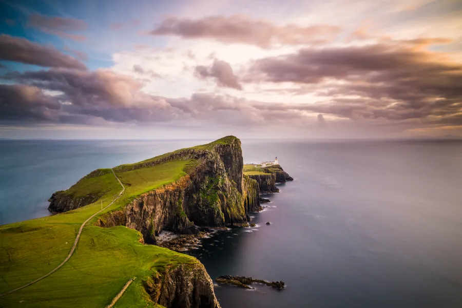
Neist Point Lighthouse on the most westerly point of the Isle of Skye
Before sunrise at the small harbour of Gwin Zégal